Tutorial : Collage
Nov. 8th, 2005 11:13 pmoops! just realized that I never reposted this when I moved all my other icon posts over here!
A few folks asked for a tutorial for one/both of these icons:


I didn't think to save the .psp files, though, so instead I've put together a tutorial to make these:


which were done using the same basic method, except that I cropped things in triangles rather than crooked rectangles.
This tutorial was made using PSP8, but I'm only using the most basic tools, so it should be easily adaptable to other programs.
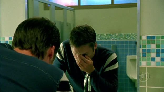
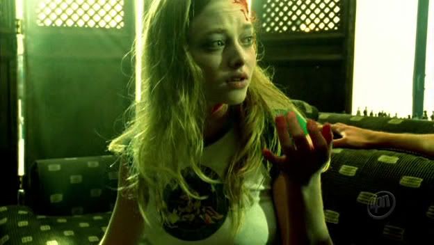
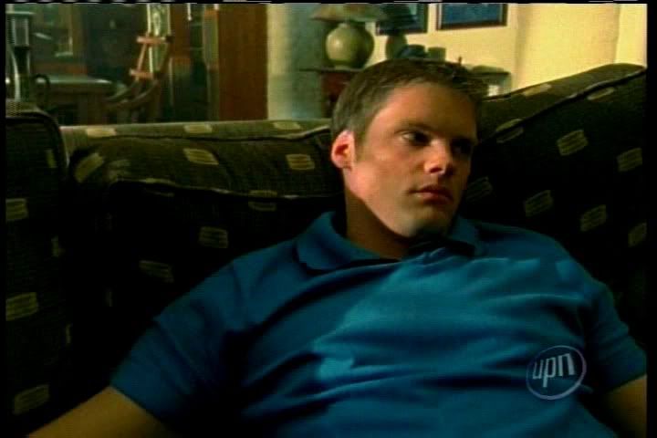
I started out with these three caps, which I'm almost positive were made by![[livejournal.com profile]](https://www.dreamwidth.org/img/external/lj-userinfo.gif) _jems_
_jems_
http://i2.photobucket.com/albums/y15/zoiciteicons2/tutorial1/Veronica_Mars_1x03_044.jpg
http://i2.photobucket.com/albums/y15/zoiciteicons2/tutorial1/Veronica_Mars_1x03_203.jpg
http://i2.photobucket.com/albums/y15/zoiciteicons2/tutorial1/536.jpg
Actually, I think the third one is from neptune-high.net
1. I cropped the three caps (and rotated the Lilly cap), resized to 100 x 100 pixels (or not in the case of cap c) and ended up with these:
a. b.
b.  c.
c.  d.
d. 
2. Next I cleaned up the bases and played with the color a little. The bases were duplicated twice and each layer was set to screen (and sharpened). The bases were duplicated a third time, desaturated, set to soft light and this layer was moved to the top. And then I believe all I added was a dark green exclusion layer between the layer set to screen and the top layer set to soft light. I ended up with this:
a. b.
b.  c.
c.  d.
d. 
I didn't do too too much with these, primarily because I plan to start chopping them up in a step or two. ;)
3. I opened a new white 100x100 canvas (which is pretty much invisible on my white background. oops! you'll just have to take my word that it's there!) onto which I copied and pasted c.

4. I then used the Freehand Selection Tool (the little lasso) to crop the image into a triangle, deleting the areas that I didn't want. I ended up with this:

This step was repeated with a, b, and d:
 ->
-> 
I wanted some white space showing between Duncan's angsty mirror triangle (c) and dead!Lilly (b), so I again used the Freehand Selection Tool to delete a few more bits of dead!Lilly:

 ->
->  ->
-> 
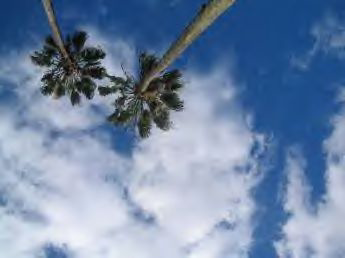
5. I wanted a little more color, so I used this stock image:
http://i2.photobucket.com/albums/y15/zoiciteicons2/tutorial1/t13.png
I pasted the image above the white background, but below all of my cutout triangle pieces, then cut out the areas that I didn't want and ended up with this:

6. Then I merged. (Save here because we're going to be coming back to this step) And that's pretty much it!
7. I added a few brushes here and there:

8. Then text:
(Haunted - font: 4990810, Size 11, color: black
by you - font: PR8 Charade, Size 12, color: white)
I converted the text to a Raster layer, selected the area of Haunted that overlapped the image of Duncan looking in the mirror. Then I went to Adjust>Negative Image to switch that region from black to white.
And there you go. The first icon is finished. From this point, the second icon is pretty easy to do.
9. For the second icon, I went back to the merged blank from step 5
I promoted the background layer so that it is now Layer 1. I created a new layer, filled it with FFFFFF (white) and moved this layer to the bottom. I then started hacking apart Layer 1 (the layer containing the blank shown above). I deleted large trangular areas of the layer using the freehand selection tool and ended up with this:

10. I created a new layer and put this below Layer 1. I started adding various brushes to fill the huge white areas (putting each brush on a new layer)
 ->
-> 
11. When i was happy with the background, I selected the Preset Shape Tool and added some circles in black on a vector layer that I moved to the top:

I converted this layer to a raster layer and used the freehand selection tool to select an area of one of the circles, again went to Adjust>Negative Image, switching this region from black to white. I added a few more circles in black and white:

12 Finally, I added text. This time the font is Romeo, size 12.
And we're done!
Hopefully this didn't end up being too overly confusing. It's a bit difficult to keep track of what's going on when you're working with so many different pieces. If you get lost, feel free to ask any questions!
A few folks asked for a tutorial for one/both of these icons:
I didn't think to save the .psp files, though, so instead I've put together a tutorial to make these:
which were done using the same basic method, except that I cropped things in triangles rather than crooked rectangles.
This tutorial was made using PSP8, but I'm only using the most basic tools, so it should be easily adaptable to other programs.
I started out with these three caps, which I'm almost positive were made by
http://i2.photobucket.com/albums/y15/zoiciteicons2/tutorial1/Veronica_Mars_1x03_044.jpg
http://i2.photobucket.com/albums/y15/zoiciteicons2/tutorial1/Veronica_Mars_1x03_203.jpg
http://i2.photobucket.com/albums/y15/zoiciteicons2/tutorial1/536.jpg
Actually, I think the third one is from neptune-high.net
1. I cropped the three caps (and rotated the Lilly cap), resized to 100 x 100 pixels (or not in the case of cap c) and ended up with these:
a.
b. c. d. 2. Next I cleaned up the bases and played with the color a little. The bases were duplicated twice and each layer was set to screen (and sharpened). The bases were duplicated a third time, desaturated, set to soft light and this layer was moved to the top. And then I believe all I added was a dark green exclusion layer between the layer set to screen and the top layer set to soft light. I ended up with this:
a.
b. c. d. I didn't do too too much with these, primarily because I plan to start chopping them up in a step or two. ;)
3. I opened a new white 100x100 canvas (which is pretty much invisible on my white background. oops! you'll just have to take my word that it's there!) onto which I copied and pasted c.
4. I then used the Freehand Selection Tool (the little lasso) to crop the image into a triangle, deleting the areas that I didn't want. I ended up with this:
This step was repeated with a, b, and d:
-> I wanted some white space showing between Duncan's angsty mirror triangle (c) and dead!Lilly (b), so I again used the Freehand Selection Tool to delete a few more bits of dead!Lilly:
-> -> 5. I wanted a little more color, so I used this stock image:
http://i2.photobucket.com/albums/y15/zoiciteicons2/tutorial1/t13.png
I pasted the image above the white background, but below all of my cutout triangle pieces, then cut out the areas that I didn't want and ended up with this:
6. Then I merged. (Save here because we're going to be coming back to this step) And that's pretty much it!
7. I added a few brushes here and there:
8. Then text:
(Haunted - font: 4990810, Size 11, color: black
by you - font: PR8 Charade, Size 12, color: white)
I converted the text to a Raster layer, selected the area of Haunted that overlapped the image of Duncan looking in the mirror. Then I went to Adjust>Negative Image to switch that region from black to white.
And there you go. The first icon is finished. From this point, the second icon is pretty easy to do.
9. For the second icon, I went back to the merged blank from step 5
I promoted the background layer so that it is now Layer 1. I created a new layer, filled it with FFFFFF (white) and moved this layer to the bottom. I then started hacking apart Layer 1 (the layer containing the blank shown above). I deleted large trangular areas of the layer using the freehand selection tool and ended up with this:
10. I created a new layer and put this below Layer 1. I started adding various brushes to fill the huge white areas (putting each brush on a new layer)
-> 11. When i was happy with the background, I selected the Preset Shape Tool and added some circles in black on a vector layer that I moved to the top:
I converted this layer to a raster layer and used the freehand selection tool to select an area of one of the circles, again went to Adjust>Negative Image, switching this region from black to white. I added a few more circles in black and white:
12 Finally, I added text. This time the font is Romeo, size 12.
And we're done!
Hopefully this didn't end up being too overly confusing. It's a bit difficult to keep track of what's going on when you're working with so many different pieces. If you get lost, feel free to ask any questions!
no subject
Date: 2005-11-11 02:54 am (UTC)no subject
Date: 2005-11-12 04:54 pm (UTC)no subject
Date: 2005-12-24 11:19 pm (UTC)Thanks again for posting this neat tutorial!
- Andrea.
no subject
Date: 2006-01-01 11:21 pm (UTC)